
 It’s been a full week with my Nexus 7 and I love this device. Will it make me pitch my Windows tablets and phone? No, but the 7″ form factor in this slim package makes it a great coffee shop/night stand/second screen while watching TV device.
To be fair, I’ve not yet bought a case or cover for it so I’m using it in all it’s stripped-down svelteness but this thing feels awesome to hold.
As I mentioned previously, it has a rubberized back and edges giving it a very secure feel in your hands and the narrow ridge that runs around the outer edge provides extra confidence in holding the device. Even out of it’s case my 8″ Toshiba Encore does not feel nearly as comfortable to hold as the Nexus 7. While the Encore does have Micro HDMI out and a Micro SD slot, it is heavier (15.87 oz vs 10 oz) and wider (5.35″ vs 4.49″) than the Nexus 7.
As this is my first real experience with Android I’ve being keeping track of what I like and don’t like about the OS. I’m trying to be as un-biased as possible and also thinking through the “do I not like this because it’s different than what I’m used to vs there really is a better way to do this?”. None of us can ignore the comfort and habits we’ve developed from using a certain device or OS for multiple years but I’m working to keep an open mind.
With that, here are some of my likes and dislikes after a week of use:
What I Like:
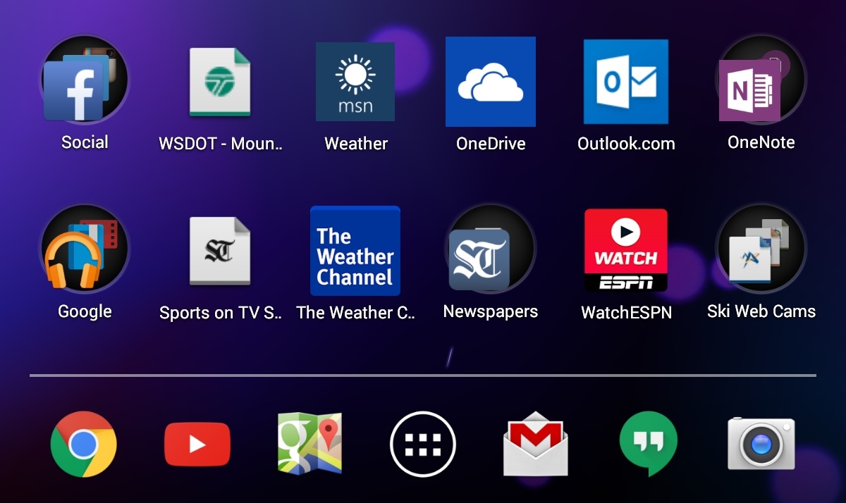
1. “Add to homescreen”:
This is pretty much a universal feature across Windows 8.x, Windows Phone, iOS and Android and I find it one of the most useful features for organizing not just apps but also the web-sites I use most frequently.
2. Foldering on the Homescreen:
Similar to Windows Phone and iOS, the ability to group and put apps and/or web-page links into folders on the home/start screen is super useful. This feature is lacking in Windows 8.x and I’m optimistic we’ll see it in Windows 10 this year.
3. Capacitive Navigation Buttons:
On the Nexus 7 the navigation buttons (back, home, overview) are capacitive instead of physical which means they have the convenience of rotating when you flip the device between holding it either landscape or portrait, allowing the navigation buttons to always be at the bottom of the screen.
What I Don’t Like:
1. Static Icons vs Live Tiles:
While I like the ability to pin apps, web pages, etc to the homescreen, I don’t like the fact they are just icons. For web-sites I find the Live Tile design of Windows Phone makes it easier to spot the link I’m looking for.
2. No “Reading View” in Chrome:
In Windows Phone and Windows 8.x there is a “Read” button that appears in the address bar when you go to a web-page which will strip out all the ads and extra navigation clutter on the screen. This Reading View is super useful and makes consuming web content so much more enjoyable. iOS also has a similar reading mode.
There is supposedly a beta of this in the current version of Chrome and I have followed the instructions here and set the flag to Enable but no reading icon appears in Chrome.
3. On the Overview list, swiping doesn’t close the app:
I’ve been happily tapping the Overview button and selectively swiping from the list of apps to, what I mistakenly thought was, close the app. After some further reading my understanding is this simply is a “most recent” list and swiping only removes it from the list, it doesn’t close the app. For that you have to go to Settings, Apps, Running, then select the app and hit “Stop”.
4. Auto-correct on email address fields:
Might be user error but on several sites when I tried to log in with my “clarkbutler@…” email address the Android auto-correct tried to correct what I was typing and changed it into a string of words.
I do realize some of this might be newbie/user-error so if any of my Android expert friends have suggestions please shoot them my way.
